
How to Photograph Jewelry for Your Online Store
Photograph jewelry in indirect daylight against a clean background, at the piece's own level, with your phone's exposure locked — five shots per listing: hero, scale reference, detail, worn, and packaging. That's the complete workflow. The best jewelry photography isn't about expensive gear; it's about consistency, color honesty, and answering the customer's questions before they become a return.
This guide covers the free setup, the shot list, phone settings that actually matter, and the photography mistakes that quietly drive returns.
The Zero-Cost Setup That Beats Most Studios
Jewelry photography has unusually simple physics: small subjects, no motion, total lighting control. That means the classic studio budget is mostly unnecessary.
- Light: a north-facing window, shooting between 10am and 3pm. Indirect daylight is the most color-accurate light source that exists, and it's free. Direct sun is the enemy — it blows out highlights and creates harsh shadows on every curve. Diffuse with a white curtain or foam board if the light is directional.
- Background: matte white or one neutral tone. A foam board or large sheet of paper curved into a seamless sweep (no horizon line) is the standard. Keep the SAME background for every product in a collection — consistency across the catalog matters more than any single shot.
- Support: shoot at the piece's level. A tripod (or a stack of books with the phone leaning) at table height, lens parallel to the subject. Shooting down at an angle is the amateur signature; level shooting reads as professional.
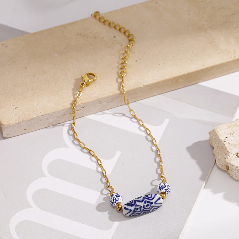
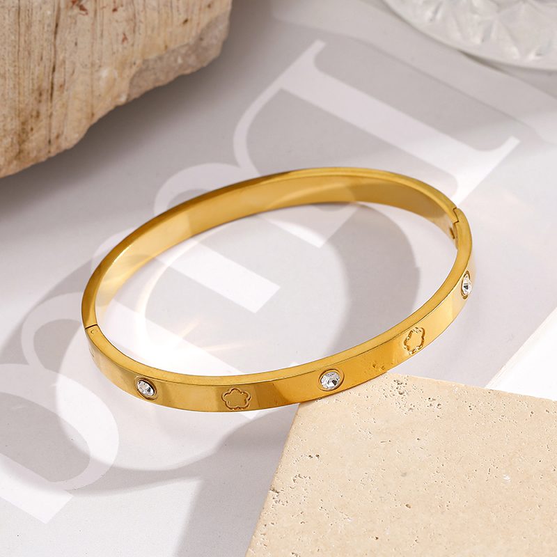
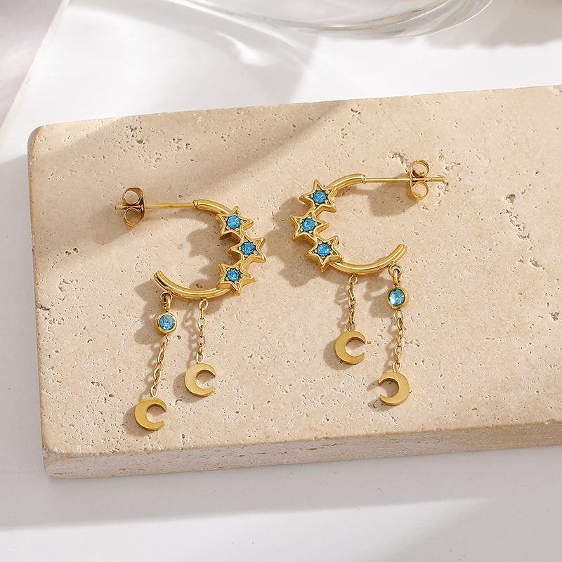
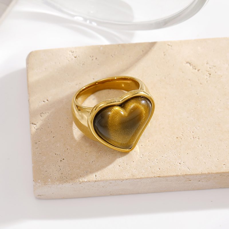
- Props, if any: keep them monochrome. Stone slabs, linen, a wooden tray — one texture, one tone. Props should support the piece, not compete with it. A busy background is a distraction the customer never asks for.
The Five-Shot Shot List for Every Listing
| Shot | What it proves | Setup notes |
|---|---|---|
| Hero | What the piece looks like at a glance | Cleanest background, best angle, whole piece in frame |
| Scale | How big it actually is | On a ruler, in hand, or next to a known object (coin) |
| Detail | Why it costs what it costs | Macro of the clasp, setting, engraving, texture — the quality tells |
| Worn | How it reads on a body | On skin in natural light; for earrings, on an ear; for necklaces, at collarbone distance |
| Packaging | What arrives in the mail | The unboxing promise — often the most shared customer photo |
The shot list is really a question list: size, quality, reality, and delivery — every one of them a return reason if unanswered. The return-rate data agrees: "not as pictured" ranks among the top return causes in fashion jewelry, and it's entirely photographer-controllable.
Phone Settings That Actually Matter
- Lock focus and exposure. Tap and hold on the piece until the lock engages. Auto-exposure hunting is what creates those brightness swings between shots in a listing — locked exposure keeps a catalog visually consistent.
- Shoot at 1x or 2x optical, never digital zoom. Digital zoom destroys the detail that jewelry photography exists to show. Move the phone closer instead.
- Kill the flash, always. On-camera flash flattens metal and bleaches stones; it has no place in product photography. The window does the work.
- Use burst mode for sparkle. For stones and polished metal, take 10–20 frames in sequence — the pocket of light that flatters a stone lasts fractions of a second.
- White balance only, minimal everything else. Correct the white balance so the metal tone matches reality (this is the shot your plating color lives or dies by), adjust brightness slightly, and stop. Over-editing is how "the color was different in person" returns are born.
The Mistakes That Cost Sales
- Color shift from aggressive editing. Saturated, contrast-cranked edits make PVD 18K gold plated pieces look like a different tone than they are. Shoot honest and edit lightly — customers who see a different color than what arrives don't just return the piece; they write a review about it.
- No scale shot. Jewelry is small; every customer overestimates size without a reference. A coin or a hand costs nothing and prevents a return category.
- The same three angles for every piece. A ring, a necklace and an earring each have an angle that sells them (band profile, pendant drape, ear silhouette). Shoot the piece the way it will be worn.
- Inconsistent backgrounds across a collection. A catalog that shifts background tone between listings reads as a drop-shipped mix rather than a brand. One background, one light source, one editing recipe — always.
The Workflow That Keeps Quality Up
Shoot in batches — one setup, ten pieces, one background. Export at web size (the platform's recommended resolution), name files by SKU for easy reordering, and keep the originals. Then repeat the recipe for the next drop instead of reinventing it: the catalog's consistency is itself a trust signal, and trust signals sell jewelry — the same logic that cut returns for the brands that got photography right.
The 3-Slider Editing Rule
Editing is where honest listing photos are made or ruined, and the rule is to touch three controls and only three:
- White balance — the most important slider in jewelry photography. Adjust until the metal tone in the photo matches the metal in your hand. This single control is what your product's "color accuracy" review depends on.
- Brightness — lift into the clear midtones, no further. If highlights clip (the metal goes pure white), you've gone too far.
- Contrast or clarity — choose one, gently. A small nudge defines the metal's texture; a big one creates the crunchy over-sharpened look that screams "edited." Never both sliders at full strength.
Skip: saturation boosters, vibrance, color grading filters, background replacement. Every one of them moves the photo away from the color the customer will unpack. A listing photo's job is accuracy first, beauty second — the beauty comes from the light you shot in, not the edit.
When to Upgrade Your Gear
The phone workflow handles most jewelry catalogs completely. The honest upgrade triggers, in order of payoff: a tripod with a phone clamp (the single biggest quality jump — impossible angles become trivial), a light tent / diffusion panel for shooting on overcast days, a USB macro lens ($, and only if your listings live on detail shots), and finally a proper camera — which makes sense only when video or print catalogs enter the roadmap. Chase light and consistency first; sensors last.
FAQ
Can I photograph jewelry with just a phone? Yes — for e-commerce listings, a modern phone in indirect daylight beats a mediocre camera in bad light. The limiting factors are lighting, background and consistency, not the camera.
What is the best light for jewelry photography? Indirect daylight (a north window, 10am–3pm) diffused through a curtain, with a white foam board as a reflector. It's the most color-accurate and the cheapest option available.
Why do my jewelry photos look flat? Usually direct overhead lighting from a single source — flat, directionless light kills the shadows that give metal its dimension. Move to indirect window light and shoot at the piece's level with the light coming from the side.
How many photos should a jewelry listing have? Five minimum: hero, scale, detail, worn, and packaging. Each one answers a different pre-purchase question, and every unanswered question is a potential return.
How do I keep colors consistent across a whole catalog? Fix the setup once — same window position, same background, same time of day, same phone settings (locked exposure, locked white balance), same light editing recipe — and shoot full batches without changing anything between pieces.
 How to Photograph Jewelry for Your Online Store
 How to Mix Gold and Silver Jewelry Like a Stylist
 How to Store Jewelry So It Stays Like New
 Gold Plated vs Gold Filled vs Vermeil: The Difference